
Trending in 2019 - Layered Shades of Green
I’ve just come back from High Point Furniture Market, where designers go every spring and fall to scope out new home related product. As valuable as it is to see the new product, I also look forward to High Point to connect with my vendors as well as other designers. The new furniture and accessories are important to see in person for quality, construction and comfort, but it’s really how they are shown that makes them memorable. After 3+ days of looking at furniture and accessories a certain fatigue sets in and your brain can’t process individual items as well as it can a beautiful room setting. I love to see how the leading furniture manufacturers elevate their product by creating these editorial vignettes and how these influence color trends that gain traction after market.
Every showroom at market had a green vignette which isn’t uncommon for spring market, but what I took note of were the shades of green and the layering of those different shades in one setting.

source unknown
Ok, this image is not from High Point, it’s from some magical Pinterest apartment I couldn’t find the source for. Between the showroom lighting and my visually overloaded brain, I did not come away with any great pictures to tell my story.
I’m going to get it out of the way right now, green is my favorite color so there was no shortage of inspiration images. As a designer I have love affairs with many colors, trending and not, but one that is always on up there on my list is green. It’s not as safe as blue, but it’s also not one of those controversial colors like lavender or mustard. A shade of it is always trending- we had preppy Kelly Green move over for Emerald and then more muted hues stole the scene in 2017. In the spring of 2019 I’m seeing darker and less saturated shades of olive and hunter greens layered in more traditional settings.

Carrier and Co’s product launch with Century Furniture, April 2019
It wouldn’t be my first instinct to match upholstery with a wall color, but it definitely has a richness to it, the sort of “I’m not afraid of commitment” attitude you see in editorial design. And maybe this works best with the color green because it’s the color of money and people always want more of it??
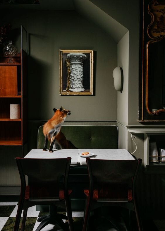
Vancouver, B.C. restaurant, La Tana designed by Ste. Marie
While I can see green always having a home in a living, dining or bedroom I expect to see more of it in kitchens and bathrooms as we make our way through 2019. Like many other designers, I find the most compelling inspiration coming from Europe. UK kitchen brands like Devol and Plain English have helped pave the way for embracing moodier colors and timeless traditional style.

Design by Plain English
No surface of this kitchen is left without texture and using various shades of the color green adds keeps the space from being monochrome without taking away from all the texture.

Architecture and interior of London home by Chan + Eayrs.
I hope you are as fond of green as I am and just as excited to see it used in these ways. Whether you like it because it’s the color of money or because it symbolizes new growth, I hope you’ll be encouraged to fully embrace it. Minimalism is out so layering color is an easy way to play with the maximalist trend that is becoming the new modern. Get a green pillow, some indoor plants and can of green paint and see where it takes you!

Design by Melanie Turner